
Digital health tools have earned their permanent residency in healthcare. Most hospitals today offer patient-facing applications — and roughly two-thirds of US patients have accessed a health portal at least once. Yet more than 95% use it passively – checking notifications, but never initiating contact with the service. Is bad user experience to blame? Which engagement tactics are even ethically acceptable in healthcare?
This is a 2Digital podcast and today we’re unpacking what it means to design for people who didn’t choose the product but are required to use it. Our guest is Jennifer Whittingham, a senior UX and customer experience leader with over 20 years of experience designing digital products across healthcare and other fields.
Lidziya: When bad user experience in other types of applications means someone gets annoyed, frustrated and churns, in healthcare the stakes are different. What is behind bad user experience in healthcare applications from the patient’s perspective?
Jenn: It can be anything from a minor inconvenience to something life-threatening. Many of the cases I looked at involved oncology patients. If an app failed to deliver medication on time, the consequences could be severe — it could send patients into withdrawal, it could directly harm their health. And on top of that, you have to account for all the regulatory and insurance hurdles patients face. A lot of the time, the app couldn’t do what was needed if insurance hadn’t been approved.
So you’re dealing with people’s mental and physical wellbeing in the most literal sense. In tech, people talk about “fail fast and learn” — that philosophy has no place in healthcare.
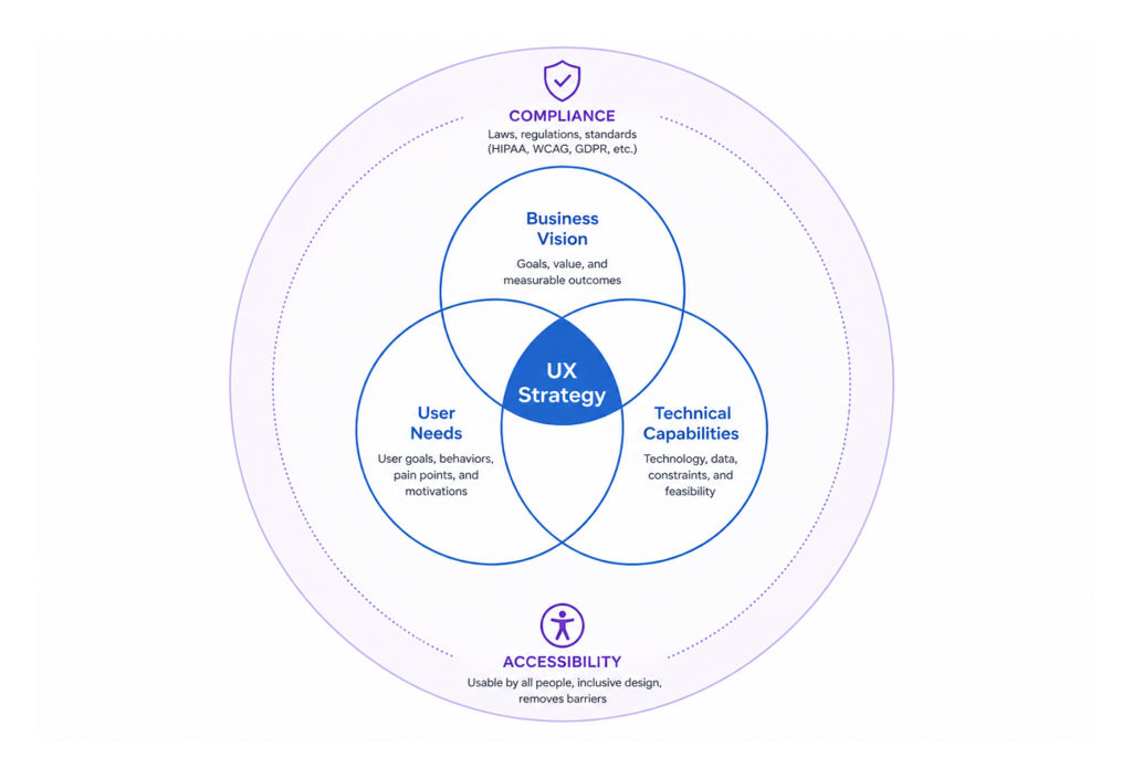
Lidziya: I came across your framework: the triangle of user needs, business goals, and technical feasibility. I hope you’ll forgive me for adding a fourth element — regulation. Because some of these apps are fully-fledged medical devices. What does regulation add to, or take from, the design process?
Jenn: It makes design harder — and it makes research harder. You’re operating under HIPAA, where patient data is tightly protected. You need formal consent agreements before you can even speak with users to understand their needs. Information isn’t always accessible, and it’s not easy to get people to participate. There are a lot of hoops to jump through just to understand the problem you’re trying to solve.
Then of course there are accessibility requirements and a range of other constraints that make the design itself far more complex. But none of that changes the fundamental goal: we have to design for everybody and make their lives easier. It’s not about making our lives easier — it’s about making the patient’s life easier.
I actually think regulation serves that goal. It forces organizations to invest in UX — because in the past, many of them didn’t. They didn’t see the ROI, so they skipped it. Now it’s regulated, and I think that’s better for everyone.
Lidziya: Sometimes the user — a patient — hasn’t chosen the application. They have a specific condition, and the physician has told them to use it. So how do you design for someone who would rather not be there?
Jenn: You have to prove its value to the patient. That means really understanding: how is this going to make their life easier? Is it worth opening at all?
Onboarding has to be frictionless — single steps, simple buttons, nothing that overwhelms. These people are already in an emotional state, already carrying the weight of their health. The last thing they need is an app that adds to that burden. And keep in mind — it’s not always the patient using it. It could be a loved one, or the healthcare provider. So how do we design for them too?
Lidziya: You’ve mentioned an important detail — it is not always the patient who comes to us — sometimes it’s relatives who are very much engaged, but they are not the person whose problem we want to solve, while patients are too old, too frail to be in the room. There’s a danger that we end up designing to a caregiver’s wishes and forgetting about the patient’s perspective.
Jenn: That is absolutely a legitimate concern. And I think that’s where design has to stay grounded: we are always designing with the patient in mind, and the doctor in mind.
Sometimes there’s a confusion about what UX actually is. People think of screens and layouts and visual polish — what I like to call the sprinkles on the cupcake. But our job is really figuring out what ingredients make that cupcake delicious in the first place. Because if you have a dietary restriction, no matter how beautifully that cupcake is decorated, you can’t eat it. The best cupcake in the world is irrelevant if it wasn’t made for you.
Our job is to understand who these people really are and what they are actually struggling with. When I first got into healthcare, I started thinking of UX the same way I think about a patient-doctor relationship. We go to the user — sometimes literally to their home or their office — and we sit down and we listen to what the problems are. Just like a patient comes in and says, “I’m not feeling well, I have a headache,” we ask questions to diagnose and understand what the problem really is. We eliminate possibilities, narrow things down, form a hypothesis. Just like a doctor says, “I think this could be your condition — let’s try this medication and come back in a week if it doesn’t work.”
In UX, we put together a quick solution — our wireframe — and we present it back to the user. Does this help solve your problem or not? And we iterate until we get it right. That’s when it goes into production.
So when it comes to families and caregivers: yes, we can enable a loved one to help navigate the app, to track a prescription, to assist if the patient is unable. But the patient’s journey and the patient’s best interest always stays at the center. It’s one whole journey across the entire experience.
Lidziya: With all of this, there’s a broader behavioral resistance: people don’t want another app, another device. They want their problems to disappear. If you introduce a new tool and tell them they’ll need to spend five extra seconds pressing a button, they’ll probably say, “I’ve been doing it without that for the last 30 years.” Does that reality dictate how you design healthcare products?
Jenn: Yes, and it absolutely will in the future. AI is becoming a significant factor here. People can get information from almost anywhere now. At the same time, it’s still new — we’re still figuring out the security implications, the governance questions.
I’ve been in this industry for 30 years, and I’ve seen these waves of transformation arrive about every decade. We think the new technology is going to solve everything. And after a while, you backtrack a little and you realize what it is actually good at — and what it’s not. I suspect the same calibration is going to happen with AI. We’ll discover what it excels at and where it creates more problems than it solves, and we’ll use it accordingly.
It should never be used for everything. It should only be used where it genuinely makes something better for somebody. And right now, we’re all still discovering what that means.
For healthcare specifically, I think of the right use of AI the way I think about a pharmacy. There are over-the-counter drugs you can safely self-select and use to get relief quickly. And then there are prescription drugs that require a physician’s approval before you can access them. AI, in my view, is the over-the-counter option. Give people enough information to calm down, handle the repetitive things, and reduce the friction. There isn’t a whole lot of harm it can do when someone is simply accessing information. But anything risky — anything that could affect a patient’s health — the AI should know when to say: “You need to speak to your physician. Let me connect you with a professional.”
Lidziya: The FDA has introduced an AI system that helps people access prescription medications. I’m genuinely not sure whether that’s a great idea — but who am I to judge?
Jenn: I think it depends entirely on what it’s doing. If it’s managing the auto-renewal of prescriptions, handling the logistics, making sure people get their medications on time — that is genuinely useful. It frees pharmacists and doctors from spending time on routine questions so they can focus on the harder, more urgent ones. That’s where AI adds real value: freeing up expert human capacity for complex problems while taking care of the predictable, repeatable work.

Lidziya: That’s a fair point. But everything you’ve described sounds like it could be solved with conventional programming. An “if yes, then” logic tree. What is it that AI actually adds here that traditional software cannot do?
Jenn: The key difference is that AI learns from behavior. A conventional program does what a human told it to do: this prescription is due on this date, send it every month. AI can observe patterns and adapt. A patient might be pushing their prescription back, suggesting they’re consuming it slower. AI can notice that, adjust the frequency, and flag it to the physician — all without a human explicitly programming that rule.
Or the opposite: a patient is running out too fast, which might signal something important. AI can detect that pattern, notify the doctor, and initiate a conversation. It’s learning from behavior over time and modifying its responses accordingly — giving both the patient and the physician a richer picture of what’s actually happening, rather than just executing a static ruleset.
Lidziya: Let’s dive into a bit of a different field. VR is arguably the most immersive, and in some ways the most invasive, type of interface we have — where everything around you is simulated. Are there specific UX principles for designing in that space, particularly in healthcare?
Jenn: In UX, we always have to ask: invasive to whom, and in what context? VR might feel intrusive in one scenario and genuinely liberating in another. Think about a child sitting in a medical chair, terrified of getting a shot. If you put on a VR device that immerses them in something delightful — what is more invasive? The fear of the needle, or the distraction of the device? In that context, VR is actually solving a problem. It’s reducing real psychological distress.
On the other hand, a patient with vertigo or severe balance issues — VR could be exactly the wrong solution. It could make everything significantly worse.
And this is really the core of what user experience is: who is our user? What is the best possible experience for that specific person? The obvious answer is often wrong. I’ve seen it time and again — something seems so clearly like the right solution, and 90% of the time, when you actually test it with users, it isn’t. The only way to know is to talk to patients, understand where they are, and design from that foundation.

NY-Presbyterian Morgan Stanley Children’s Hospital
Lidziya: You just reminded me of something I encountered recently — a VR system designed to help children get through the fear of injections. The team behind it told me that their default visual environment turned out to be completely wrong for the children they were serving. It was whales, or something along those lines — not relevant, not engaging. When they switched to locally familiar cartoons, the impact was dramatic.
Jenn: Yes — and that kind of insight is something you could never predict from behind a desk. So many hospitals are doing remarkable work in this space right now. An MRI machine is genuinely terrifying for a small child — a large, loud tube in a cold, sterile room. A company I researched transformed the entire experience into something like a trip to Disneyland. When the child walked through the front door, staff greeted her as “Captain Emma,” gave her a pirate hat, and walked her down the “dock” to a room decorated entirely as a pirate scene. The MRI machine was the pirate ship. The sounds of the machine were synchronized with the narrative playing in the room. When it was over, she received her gold coins. It was an adventure, not a medical procedure.
For adults, designers are now creating hospital rooms that bring in elements of the outdoors — natural light, organic forms, materials that change the emotional and sensory environment. And that shift in environment genuinely affects how patients feel — sometimes even how they heal. Because the real barrier is rarely the treatment itself. It’s the fear of the unknown. It’s the fear of the experience. Our job is to dismantle that fear as much as we possibly can.
Lidziya: I would want a pirate hat. Why not?
Before we close, I found something you’ve said — that your purpose is allowing others to experience their greatness. In healthcare, people are often using our products at the absolute lowest point of their lives. How does that shape how you think about design?
Jenn: Design can’t erase illness. But it can give people back a sense of agency. And that is often where their greatness shows up.
When someone is at their lowest point, our job isn’t to aim immediately for a delightful experience. First, we ask: how do we bring them just back to baseline? Because even that — even making someone feel normal again, calmer, less alone with their fear — makes a meaningful difference.
Then, once baseline is achieved, we ask: how do we go from baseline to genuinely good? We map the journey. We identify the lowest points, the moments causing the most pain and anxiety, and we solve for those first. Then the next. Then the next. Until the person feels safe, feels that they can trust this tool to genuinely support their healthcare journey.
A digital product is only one part of caring for a person. It needs to make the journey better. It does not need to be a barrier — and if it is, we should remove it. That’s the test. Is it improving their experience or isn’t it? If the answer is no, it has no place in their life.